
TED.com Redesign
Project Overview
Project TypeWeb design
RoleUser research, UX/UI design
Time2019 - 2020 (8 weeks)
ToolsSketch, InVision
DescriptionIt is a redesign case study of the existing Ted.com. The as-is experience was analysed by 32 in-depth interviews and evaluation and a user persona, user flow for a better experience was created based on the research. The enhanced searching, result browsing and the watching (detail page) experiences are suggested from this case study.
* This is an individual project and not related to TED organisation.
** This is my first UX case study. 🙂
Challenge
There are MORE ideas worth spreading on TED talks website. and the website can appeal to more people. The current UX can be improved to achieve this goal. By doing so, it can also give a unique and satisfying experience to users that any other websites are not able to do.
User Research
In-Depth Interveiw
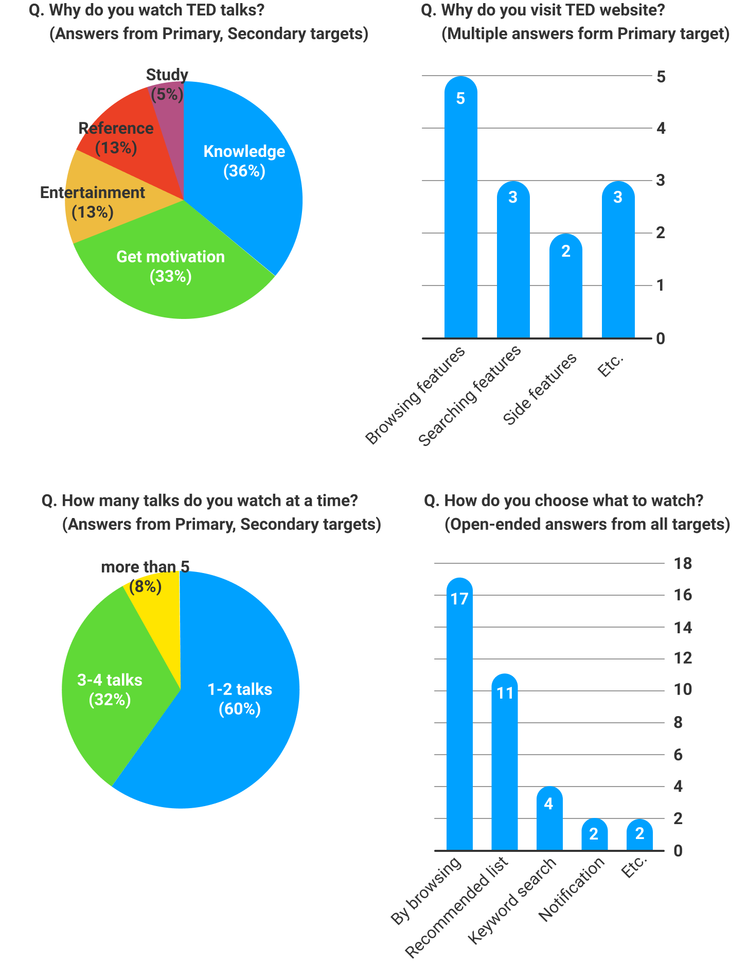
To figure out how users use the website, and their needs for using it, I interviewed 32 people.
- Primary target: users who frequently visit TED talks website (31%).
- Secondary target: users who watch TED talks via other platforms like TED app (47%)
- Tertiary target: users who are not aware of TED talks but watching videos on video platforms like YouTube (22%).
Basic demographics are as follows: There are 18 males and 14 females. The age range is from 19 to 34. Most of them are college students(72%), there are also workers(25%), and one person who is between his jobs. (I tried to interview various college majors to get more validity as possible).
Define
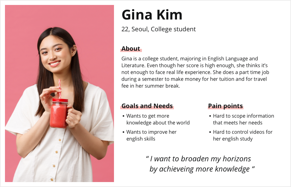
User persona
From the interview data, I created a user persona that represents the primary target for using TED Talks website.
User Flow
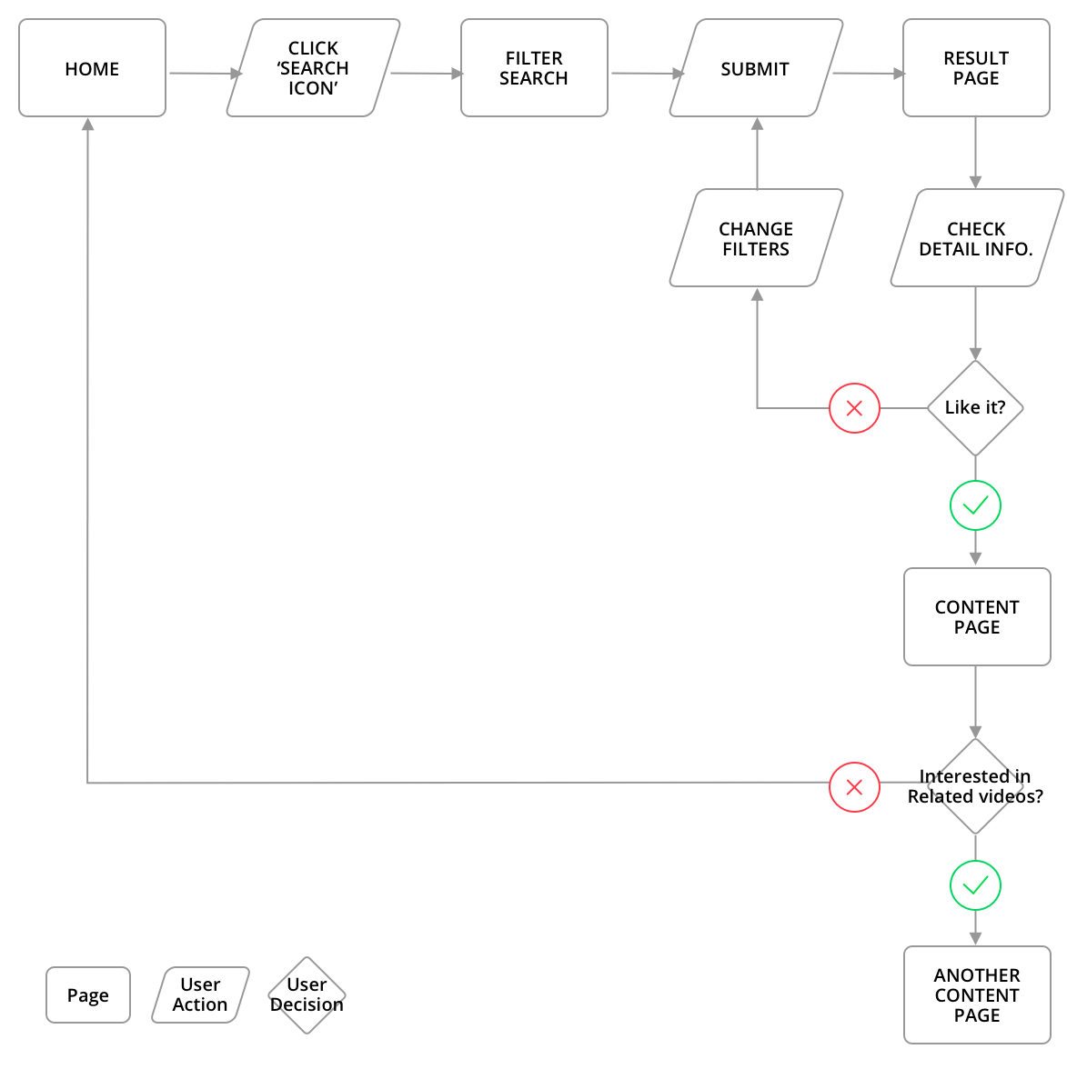
Based on the interview data and ideation, I created a path that Gina (the persona) will follow to find the video that she is looking for.
Design
1. Redesigned Searching Experience
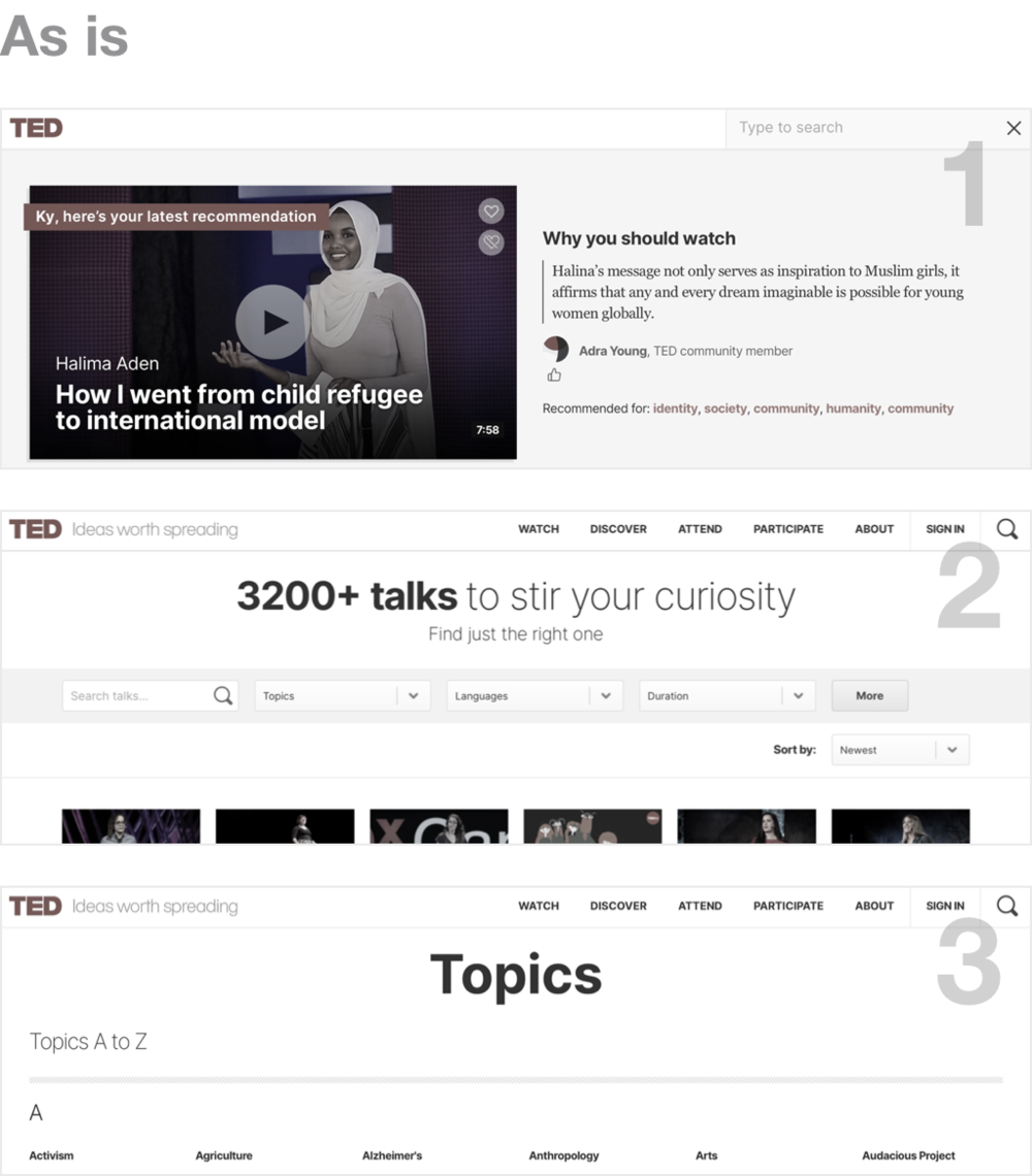
ProblemsThere are 3 different ways to search videos but users don't know they exist. As the research says, users just use the first search method (only 30% of primary targets mentioned the second method but they still don’t know how to get there.)
SolutionsMy main goal is to make other methods easily reachable so that users can find more curated videos for their purpose.
- I added a filtered search on the first method. By clicking a down arrow, users can add filters.
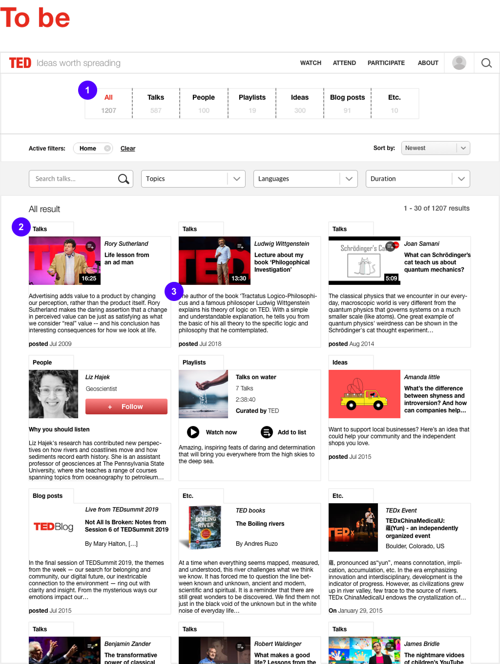
2. Search Result Page
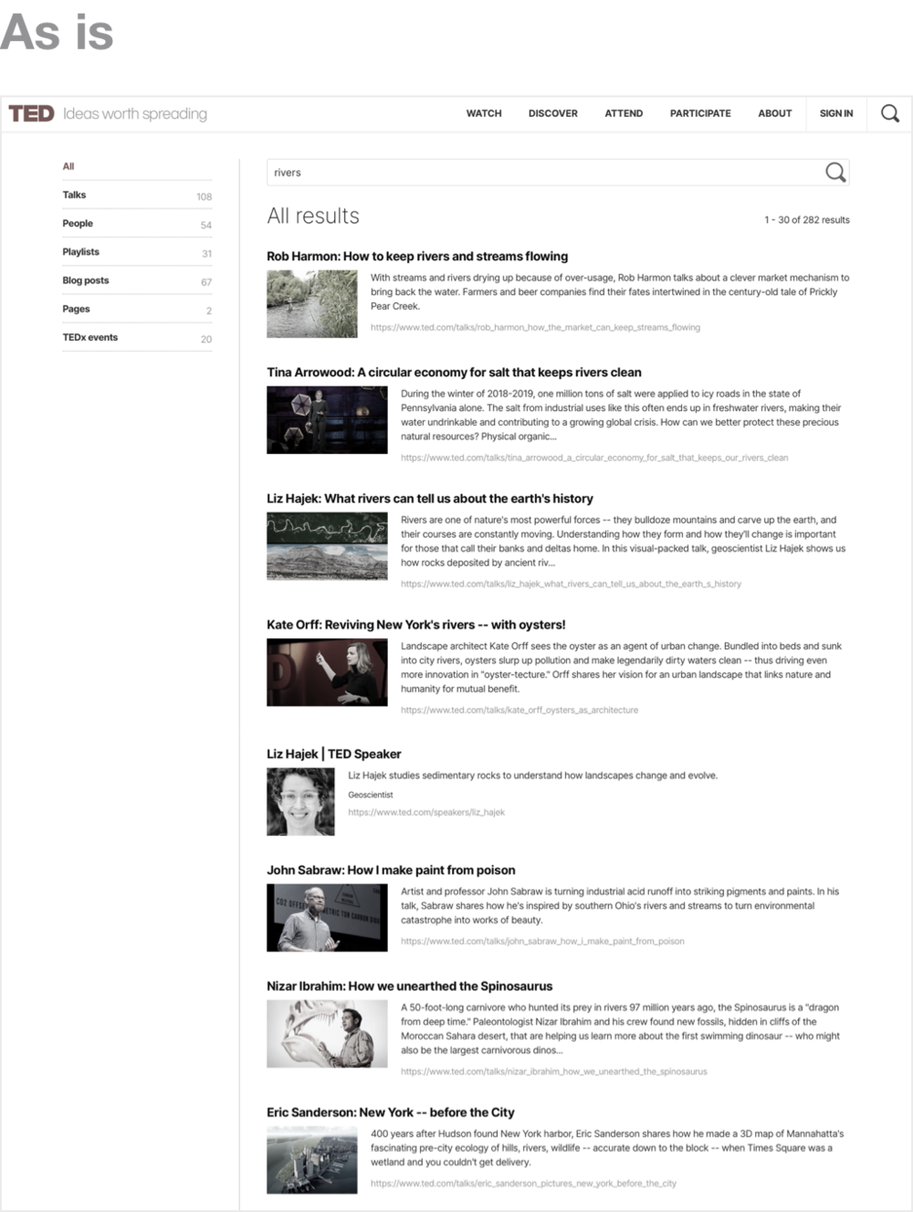
ProblemsThe result page is not organised and it is hard to attract users to read the body texts of each content. It’s because:
- It's hard to figure out the category of content such as talks, people, playlists, etc.
- The body text of each content is too lengthy to read
Solutions
- I put the category list on the top of the page so that users can easily figure out what category they are looking at.
- I added a label on each content that says what category this content is belonged to.
- I created a card style of content. In this way, users can simply read the body text since it is not horizontally too long. Also, users can see more content without scrolling their screens than before.
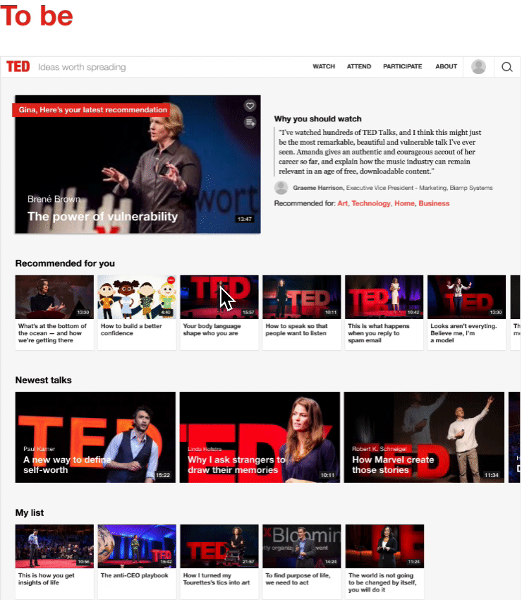
Content Page - Watching Experience
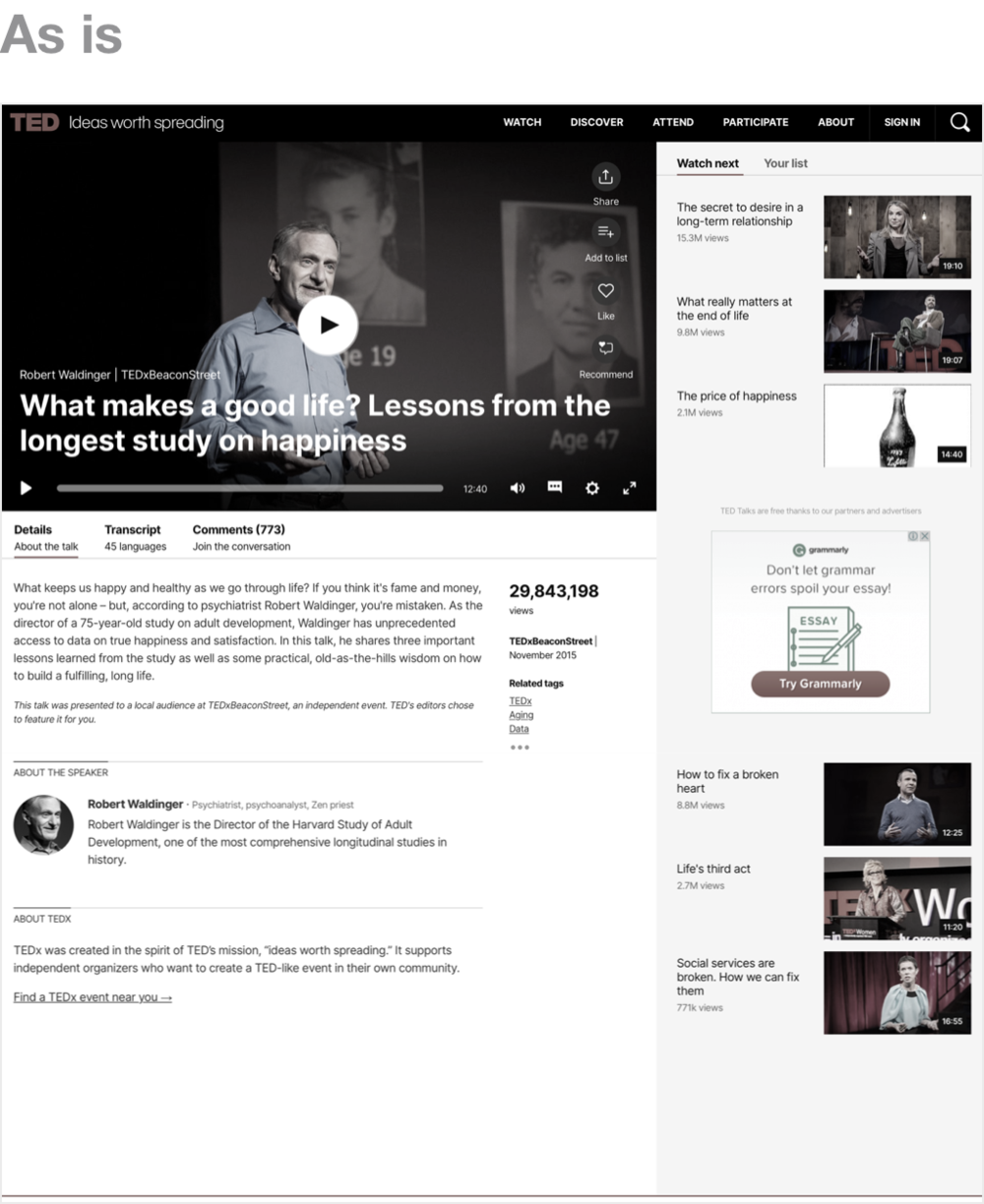
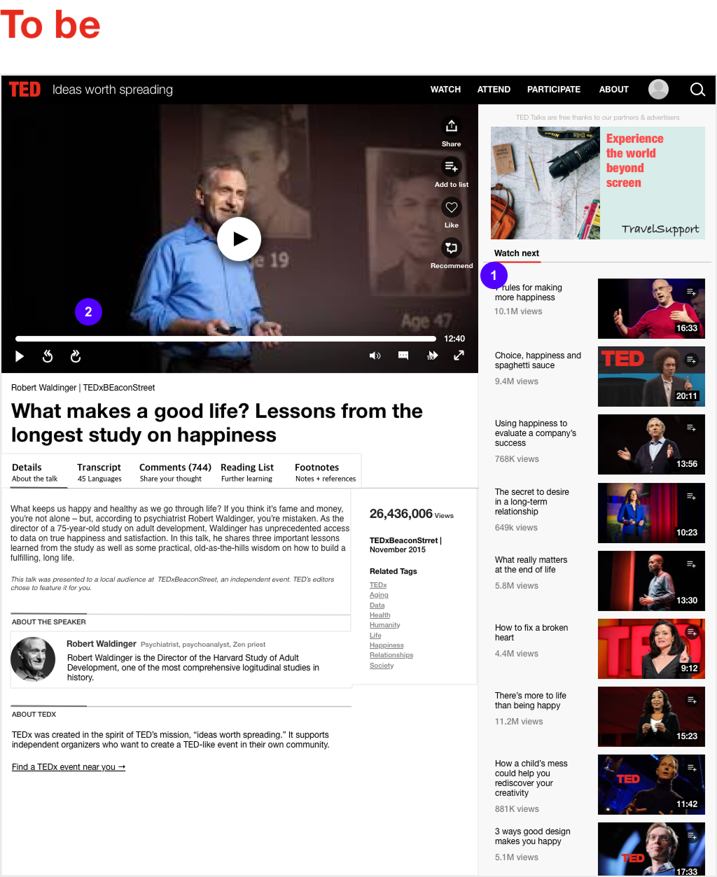
ProblemsUsers can be easily frustrated on watching pages because some features are not similar to other video platforms. Also, this page doesn’t satisfy what users want when they watch a video.
- More than 30% of interviewees find the next video to watch in a recommended/related list. The previous watching page, however, has only 6 recommended videos.
- The video-watching features don't support features what other video platforms do. For example, it doesn’t support rewind and fast-forward features even though there are users who want these according to the research.
- The title of the video blocks the thumbnail before the video starts, or when paused.
Solutions
- I added more videos in the ‘Watch next’ section. Clearly, it will attract more users to stay longer on TED Talks website, and make them learn more knowledge.
- I improved the video screen interface to increase users’ satisfaction with watching the video. I added a rewind and fast-forward feature because some users want these for a better watching experience. Also, I relocated the title so that it won’t hide too much space in the thumbnail.
Key Takeaways
Experience is the best teacher.I was confident about what I am capable of after reading books and studying but the actual experience made me realise I need to study more. Even an easy-looking step needs a sincere effort because knowing is one thing, and doing is another. The more experience I get, the better I will be.
Feedback is essential during the design process.It was a solo project, but I may not be the only person who has built the final prototype. Because I got lots of feedback in every step. To get genuine feedback, I refined questions repeatedly, I reached out to numerous people. Every feedback helped me to make a better process and outcome.