
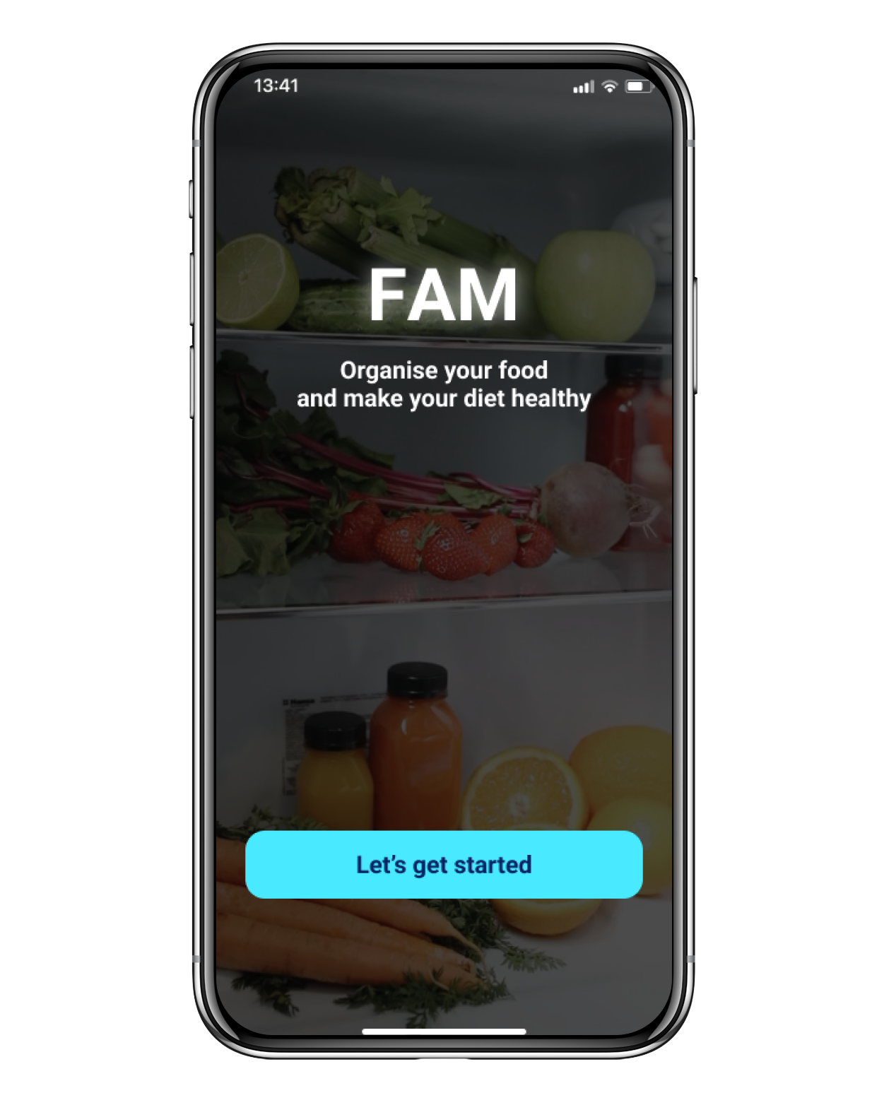
FAM, Fridge and Me
Project Overview
Project TypeMobile app
RoleUser research, UX/UI design
Time2021 (5 weeks)
ToolsFigma, ProtoPie
DescriptionFAM is a mobile app concept design that helps users manage the food in their fridge and their diet. The research was conducted to understand the pain points of the target audience related to the goals. The designed experience aims to achieve the goal by providing features such as a food management home screen or an analysis page to track the diet.
Design Process
Challenge
How might we manage food in a fridge efficiently?It is easy to forget what food is in a fridge, and it is hard to track an expiry date of each food. Some might be already expired. As a result, the fridge gets unorganised and some foods become food waste. An easy way is necessary to manage food in the fridge.
How might we have a more balanced diet easily?Having a well-balanced diet is difficult because it is hard to figure out what to eat and how much to eat. Based on the five food groups, we have to eat a proper amount of food to have a balanced diet. However, the proper amount differs from person to person. We need a simpler way to calculate them to solve this problem.
Empathise
The purpose of this research is to make the problems more solid and to find some insights for the next step by understanding the food waste situations and users’ behaviours. In this research step, I collected data related to the problems through online research (Background research), user survey and competitive analysis.
Background Research
- 30-50% of all food produced remains uneaten and, therefore, wasted.
- In most developed countries, over half of all food waste takes place in homes.
- Food waste is worth £700 per year to the average UK family ($2,275 in the USA) in homes, which collectively adds up to £14 billion per year.
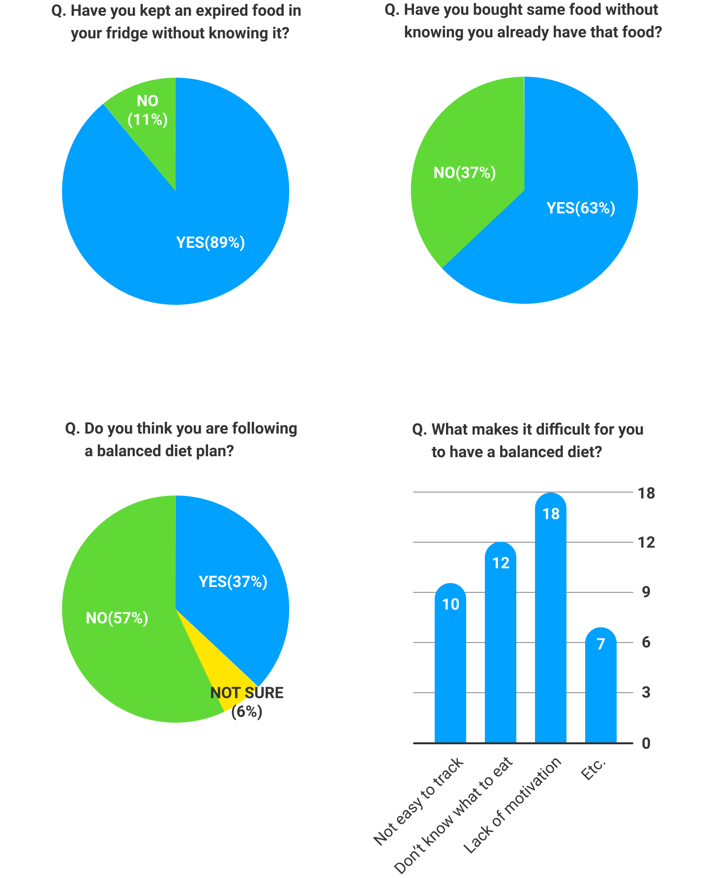
Survey Research
This survey is to figure out how people actually experience the problems in their daily lives. 35 people answered to 7 refined survey questions (The image below contains a part of the survey results).
Summaries
- It is difficult to organise food in a fridge. People forget what they already have in their fridge or expiry dates of each food.
- It is hard to have a balanced diet. People don’t know what to eat for a healthy diet and they have trouble tracking their diet.
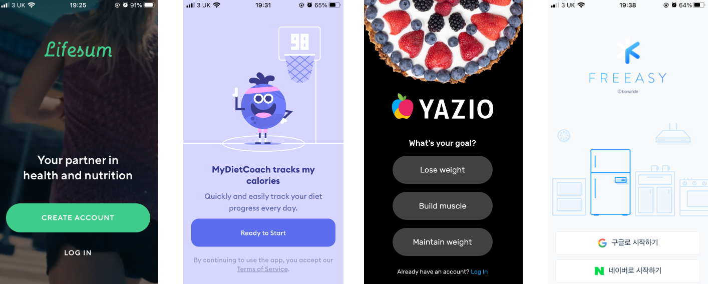
Competitive Analysis
To figure out how other applications solve similar problems, I analysed the features and interfaces of similar apps (The image below are part of the apps analysed).
Insights
- Showing a list of food and expiry dates helps users to organise their fridge.
- It is important for users to add food in an easy way to organise their fridges.
- People need to get useful information easily to have a balanced diet.
Define
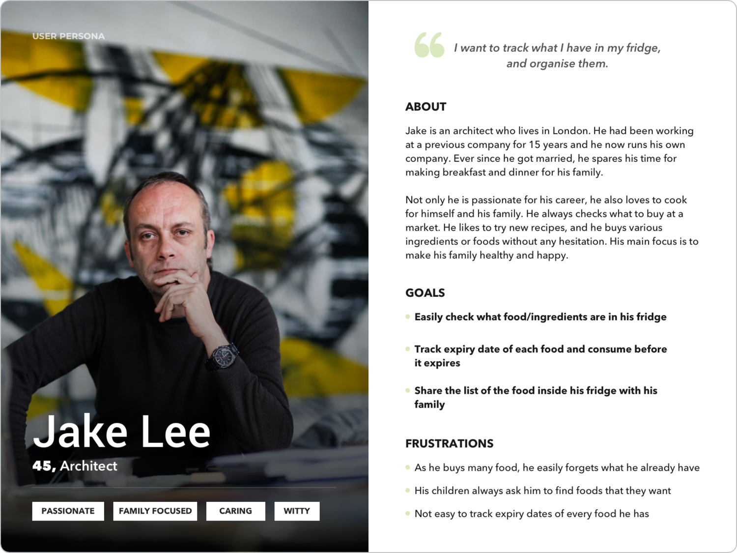
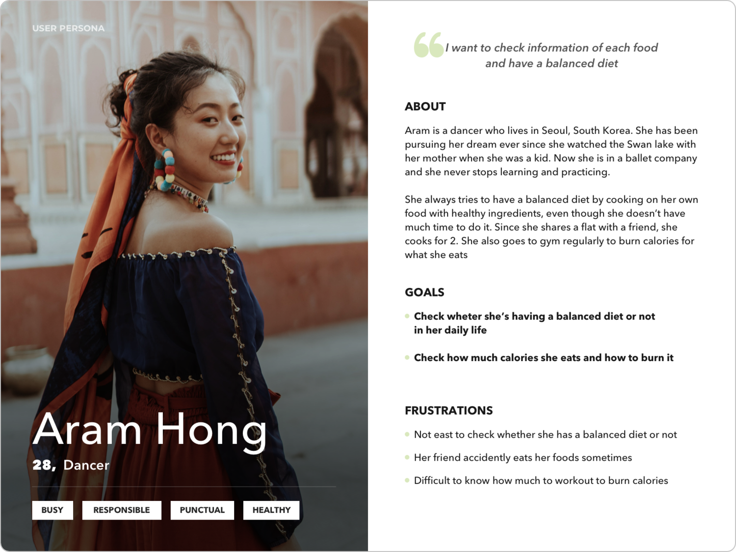
User Personas
Based on the data and insights from the research step, I created two user personas. Jake's persona mainly represents the first problem (organising foods in a fridge), and Aram's persona represents the other (having a more balanced diet).
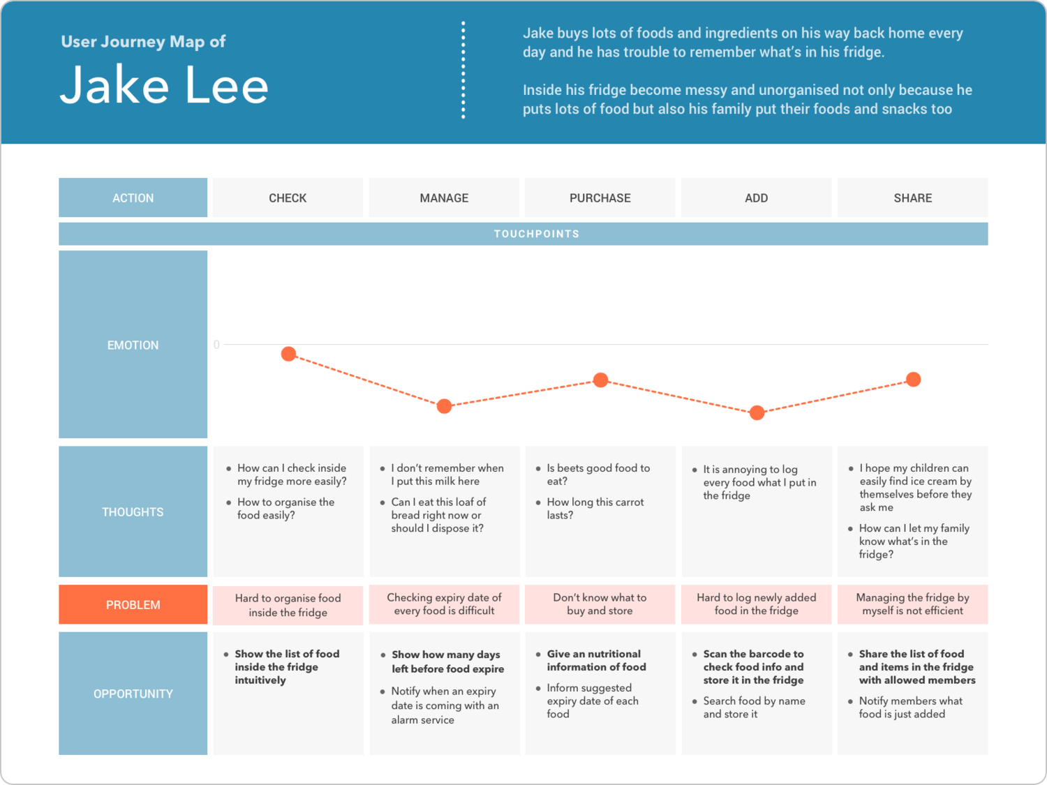
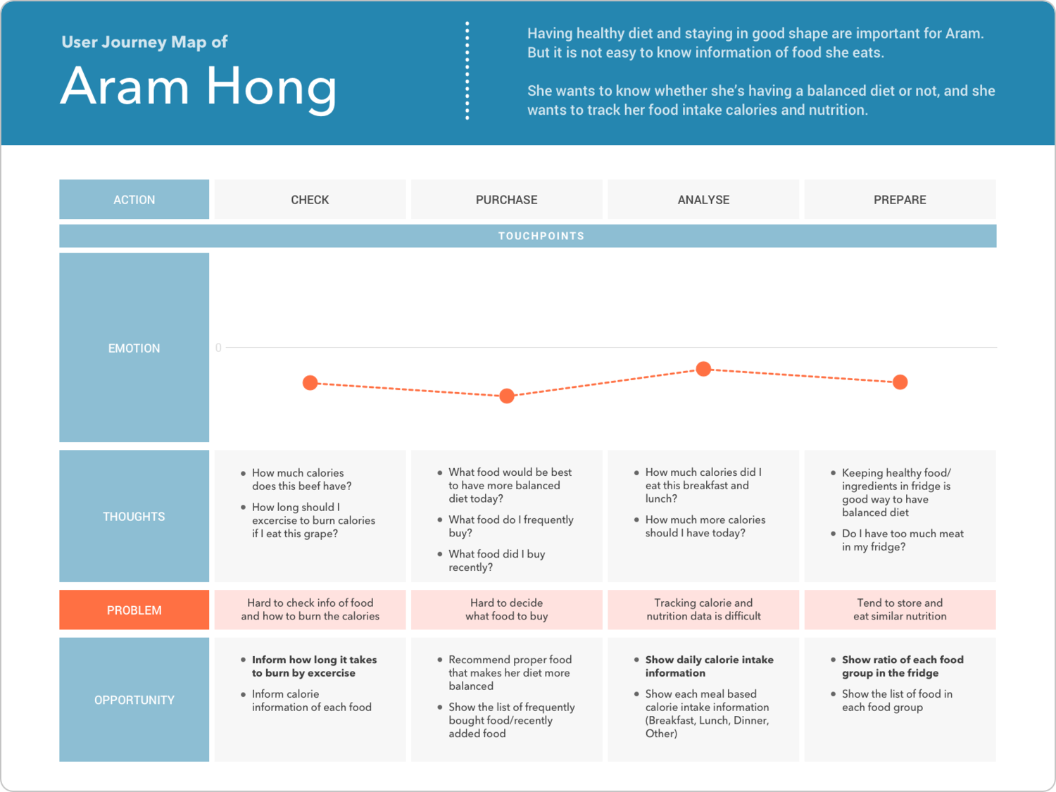
User Journey Maps
For a deeper understanding of the problems and solutions, I created a user journey map of each persona. Jake’s journey map shows the process of how to organise his fridge. Aram’s journey map, on the other hand, shows the process of having a balanced diet.
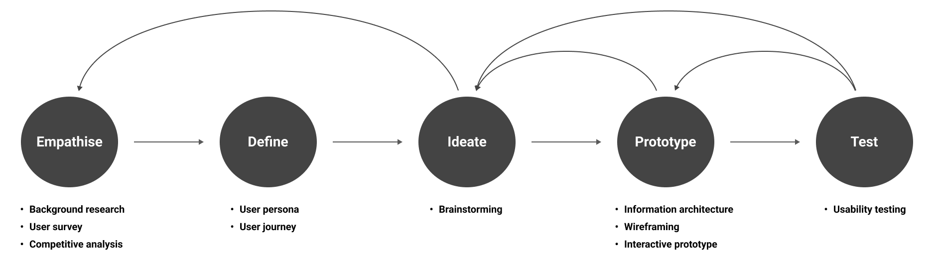
Ideate
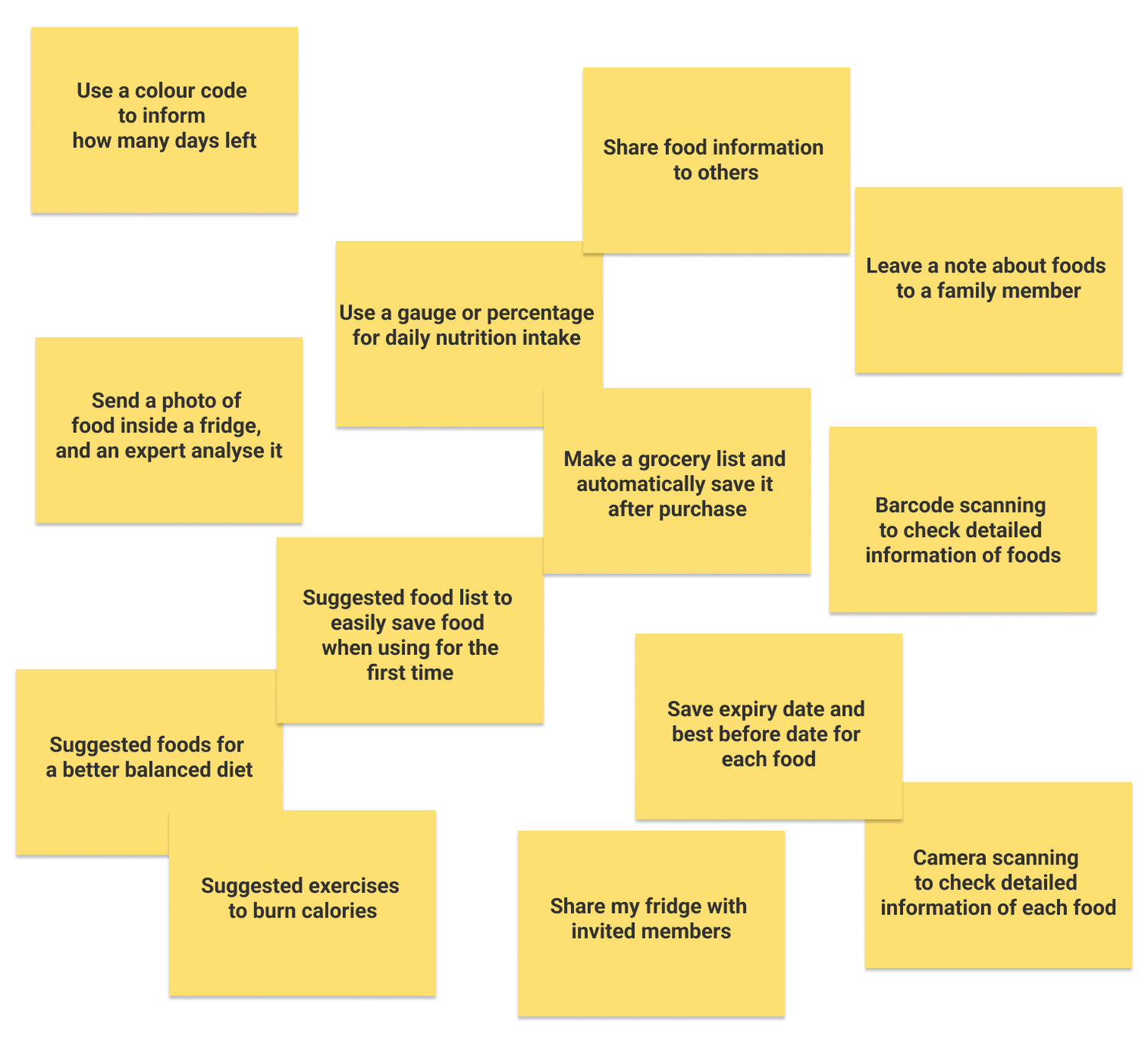
Brainstorming
Possible solutions were generated during this ideation phase. Every solution had the potential to become a feature of a final product, but they needed to be prioritised. The most goal-relevant and user behaviour related ideas/features are selected from the brainstormed outcomes.
Prototype
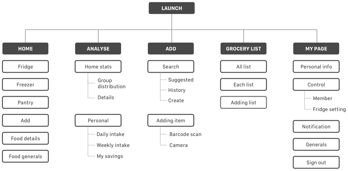
Information Architecture
After the research and ideation, a site map style IA was created to organise main features and the structure of the application.
Wireframes
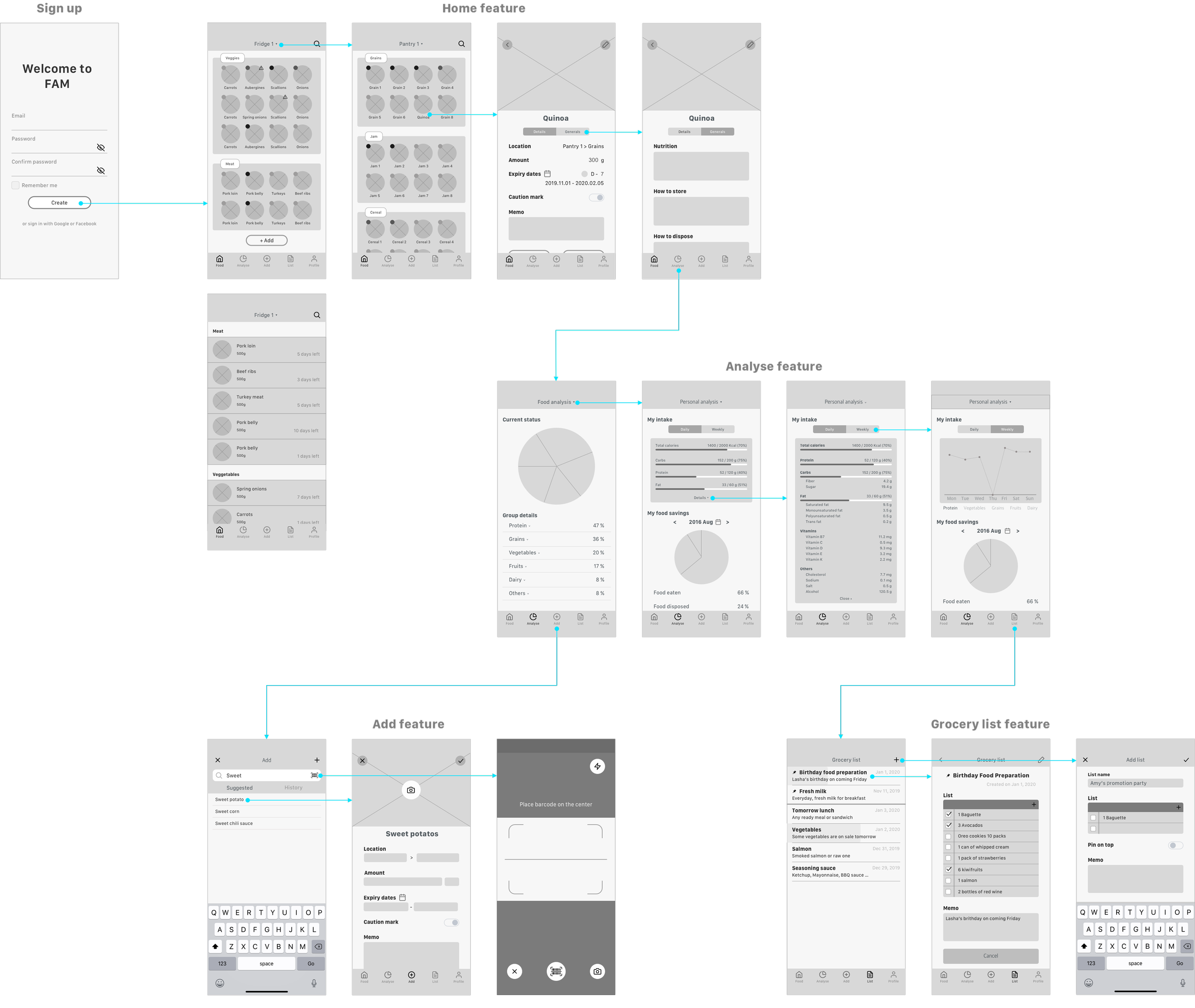
Hi-Fidelity Prototype
First draft - Main pages only.
Test
With the high-fidelity prototype, I conducted usability testing. The main objective of this usability testing is to figure out what usability problems (issues) the product has. 5 people participated and conducted 2 assigned tasks. Not only their task result but also their entire experience of using the app became sources for iterations and improvements.
Iterations
The inspiration from the test gave the app more chances to improve. Observed and recorded problems are solved with new ideas and better UX. The main improvements are as follows:
- Simplified information architecture: The structure of the app changed. Redundancies are removed (e.g. “grocery list” tab).
- Intuitive user flows: Users can check more information with little effort than before.
- Better micro-interactions: Users can understand how each feature works better with micro-interactions.
- More aesthetic focused design: Overall user interface design is improved.
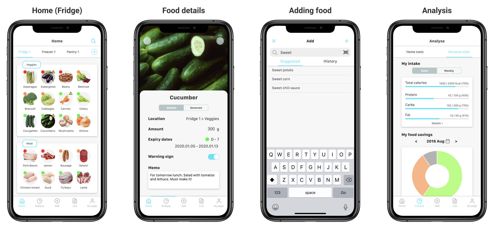
Iterated Prototype
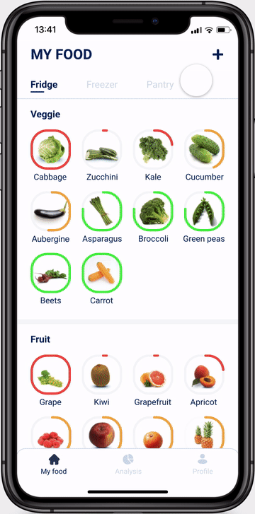
Check what you have in your fridge (Home).Users can check what food they have in their fridge, freezer and pantry. All the food is grouped by categories such as vegetables, meat, etc.
The coloured circle around the food image represents how many days are left till the expiry dates. (Green=more than 7 days, Yellow=3~6 days, Red=less than 2 days, Full red=already expired).

Check detailed information about each food (Food details).Users can check the information about each food. The app provides percentage daily value, nutrition facts and how to burn information of the food, along with specific data such as serving size or how many days are left.
Add food to your fridge (Adding food).Users can add new food to their fridges. They can easily scan a barcode on the food package or they can search for food to add it.
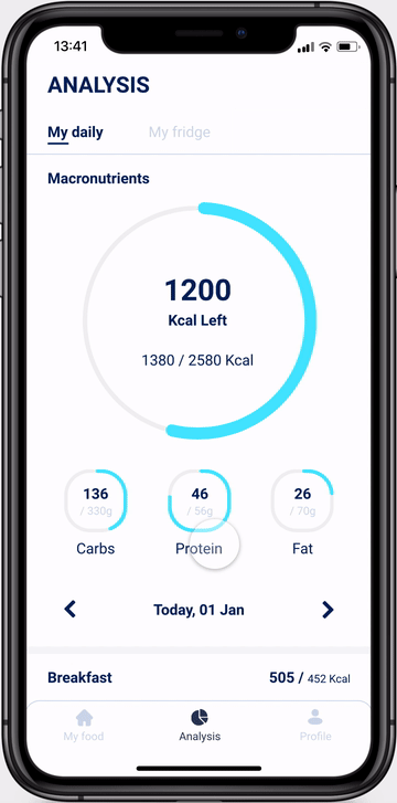
Analyse what you eat and what you have (Analysis).As users consume food and log it, they can see their diet analysis. It shows the total daily calories, macronutrients and how much they have eaten that day. Also, users can check the analysis of food in their fridge based on the food group.
Interactive Prototype
Click the image below or this link to try the interactive prototype. If it takes too much time to load screens, please consider using the Chrome browser.
(Note: The list of food is reduced when a user store food for the first time, to make the prototype simple.)
Key Takeaways
Iterations and Improvements are more important than building a product.Usability testings and further ideations can lead us to have better ways to solve problems. This project also has been improved after several usability testing but still has more possibility to improve.
Micro-interactions help users understand how an app works.Users need more guidance when they use an application for the first time. Small but intuitive micro-interactions describe the goal of each feature and assist users to comprehend the app.
Results and Future
CEO of Cooking Mate contacted me after she read this project and offered me a job, saying she and her team are interested in developing this application. However, I got another job offer during the work with Cooking Mate. Due to the situation change, the app development has been cancelled.
Accessibility of the experience inside the app needs some improvement, such as colour contrast between text and background, or using more than sole element to differentiate information (e.g. using only colour to represent different expiry dates).